The two random words that i chose for this logo was "Turbulent" and "Volcano". To start with I started drawing a few designs of the logo so that i could then pick my favourite and create it in Adobe Illustrator. Here are a few of the designs.
When creating the design i used many different shapes and the shape builder tool to create the desired shape. I then used the paintbrush tool and the text tool to add the extra details.
Monday, 2 February 2015
Logo - Loud Lady Bird
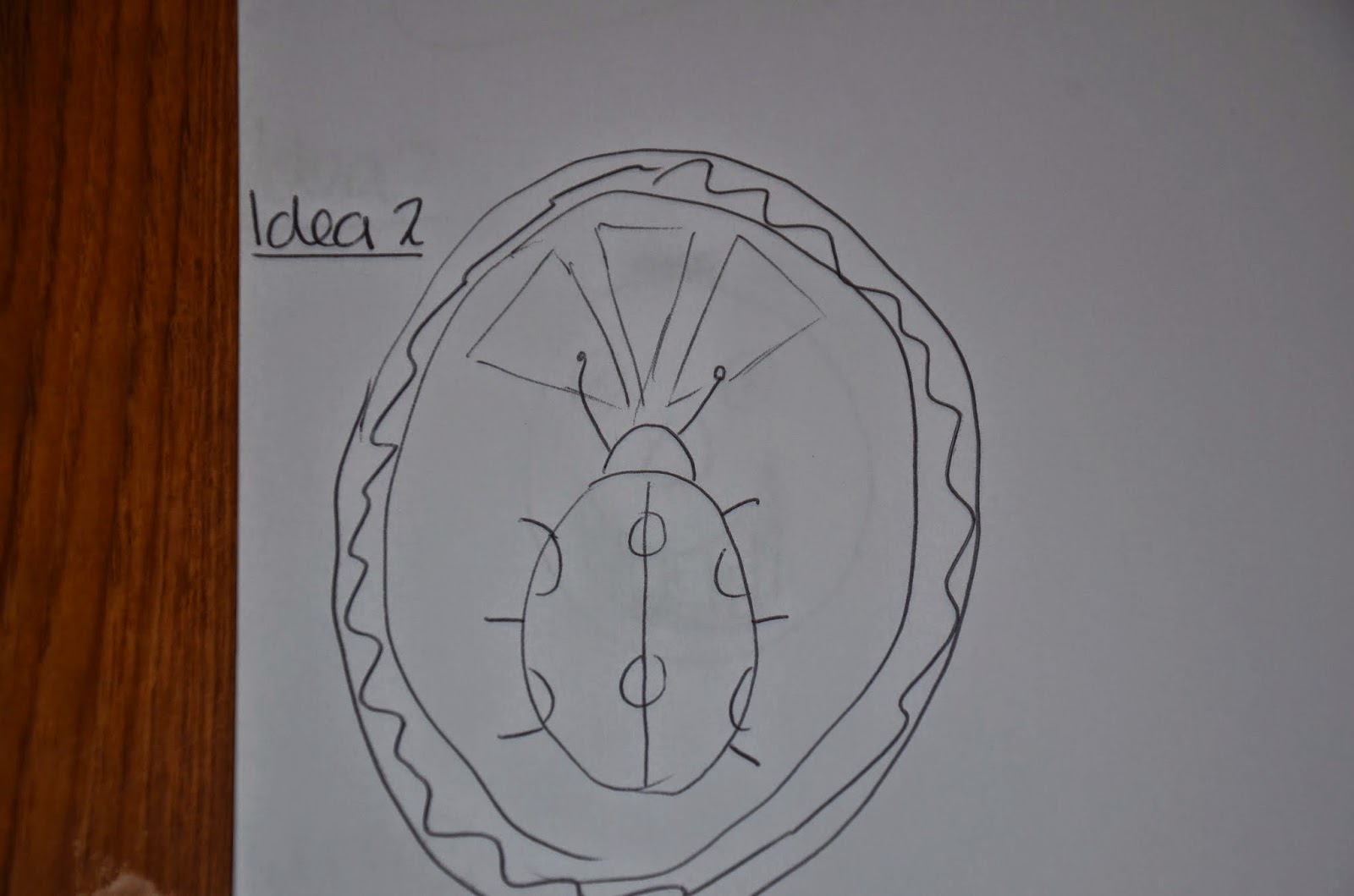
To start with I picked two random words these were "loud" and "ladybird". I then thought of a few different logos which could incorporate these two words and what type of comapny this logo could have been used for. In the end i chose that it would be an audio systems company for example speakers, microphones and headphones. . Here are a few early drawings.
Once I had decided which logo I was going to use i opened Adobe Illustrator and started making it. To start with i just made all the shapes and gave them the right colours so that i could put them together later.
I then put all of the shapes together to make the shape of the desired logo.
Once i had put all the shapes together i needed to make some changes so that it looked neater and more like a ladybird, the way that i did that was to use the shape builder tool.
To finish off i wrote the\name of the company underneath the logo. I did this using the text tool. Here is the final image.
Shepard Fairy Artist Study
Shepard Fairey is an american graphic designer who was born on the fifteenth of February 1970 and was brought up in South Carolina.
Fairey was first introduced into the art scene when he was a child, he used to paint and draw on skateboards and t shirts. As time went on and he became more recognized he created many famous peices of work. A few of these would be the hope poster (used in Barack Obamas Presidential campaign of 2008), the Obey poster of Andre the giant (a famous wrestler) and Cash, Cans and Candy.
He uses many different methods to create his artwork. As he is first and foremost a graphic designer, he does a lot of work on computers by using image editing and enhancing software such as the adobe suite or softwares that are similar. However he does also create physical peices of art, such as large paintings, he uses spray paint and a large wall or building often to create a large face for Obey, the main company he works for.
Fairey was first introduced into the art scene when he was a child, he used to paint and draw on skateboards and t shirts. As time went on and he became more recognized he created many famous peices of work. A few of these would be the hope poster (used in Barack Obamas Presidential campaign of 2008), the Obey poster of Andre the giant (a famous wrestler) and Cash, Cans and Candy.
He uses many different methods to create his artwork. As he is first and foremost a graphic designer, he does a lot of work on computers by using image editing and enhancing software such as the adobe suite or softwares that are similar. However he does also create physical peices of art, such as large paintings, he uses spray paint and a large wall or building often to create a large face for Obey, the main company he works for.
My favourite piece of his would be Peace Goddess; it is based loosely on a portrait from Greek currency and is the daughter of Greek god Democritus. The reason this is my favourite is that it is very simplistic in the ways that there is a lack of shading however there is still a great amount of detail in the way the picture is drawn as well as the colours and the shapes.
Charlie Adlard Artist Study
Charlie Adlard is a British comic book Illustrator. He was born in Shrewsbury, England on the 8th of April 1966.
Adlard has worked as an artist for many different comics such as; Judge Dredd, War Games, the X-Files, Hellblazer and more. However he is probably best known for his work on the Walking Dead graphic novels and Savage.
When making his work he makes a physical copy, drawn with different types of pencils and pens. He then scans his work to make a digital copy, he now uses an image editing software such as Adobe Photoshop to add more details such as shading and colours. Once this is done, it is laid out so that it is in a logical order and then is printed out in the masses so that the public can buy the comics.
My favorite piece that Charlie Adlard has done so far would be the cover of The Walking Dead graphic novel's 100th episode. This is my favorite because it shows many different things, all with their own meanings and with massive contrast. On the majority of the page there are hundrerds of either zombies or dead people, in my opinion, this shows that the epidemic has come a long way and killed or taken many people, leaving Rick and other survivors the minority, this is supported by the image of Rick stood up in the background looking lonely and isolated. I also like how the dead people have been drawn in great detail with more realistic looks and using colour, this shows how the comic has evolved since it started, as they have become more popular they have more money and therfore can create illustrations that look this good, this is contrasted by the very simply drawn rick.
Adlard has worked as an artist for many different comics such as; Judge Dredd, War Games, the X-Files, Hellblazer and more. However he is probably best known for his work on the Walking Dead graphic novels and Savage.
When making his work he makes a physical copy, drawn with different types of pencils and pens. He then scans his work to make a digital copy, he now uses an image editing software such as Adobe Photoshop to add more details such as shading and colours. Once this is done, it is laid out so that it is in a logical order and then is printed out in the masses so that the public can buy the comics.
My favorite piece that Charlie Adlard has done so far would be the cover of The Walking Dead graphic novel's 100th episode. This is my favorite because it shows many different things, all with their own meanings and with massive contrast. On the majority of the page there are hundrerds of either zombies or dead people, in my opinion, this shows that the epidemic has come a long way and killed or taken many people, leaving Rick and other survivors the minority, this is supported by the image of Rick stood up in the background looking lonely and isolated. I also like how the dead people have been drawn in great detail with more realistic looks and using colour, this shows how the comic has evolved since it started, as they have become more popular they have more money and therfore can create illustrations that look this good, this is contrasted by the very simply drawn rick.
Ron Mueck Artist Study
Ron Mueck is an Australian artist, based in the UK with a background in special effects for both the television and film industry. His main field is Scale Manipulating Hyper realistic Sculpting. Muecks work is predominantly sculptures of humans both over sized and undersized, however they are often in unusual situations. His work consists of a huge range such as babies, old people, dead people, faces, nude people and much more.
He creates his work using a mixture of materials but mainly e uses fiberglass and silicon. He gets his inspiration from real people as well as previously made art. An example of this would be when he was invited to be an associated artist at the national gallery in London where he was inspired from the gallery’s master artist’s work such as the virgin with child to which he responded with Mother and child.
My favourite piece of his art would be Dead Dad, this piece of art (like all his other) are extremely realistic however it is about 3 feet tall, naked and withered. The main message of this piece is that before you die you are often extremely vulnerable and that is exactly what it shows. It is my favourite piece due to the high attention to detail and the extreme realism, from all the photos I have seen it looks like an actual dead body.
He creates his work using a mixture of materials but mainly e uses fiberglass and silicon. He gets his inspiration from real people as well as previously made art. An example of this would be when he was invited to be an associated artist at the national gallery in London where he was inspired from the gallery’s master artist’s work such as the virgin with child to which he responded with Mother and child.
My favourite piece of his art would be Dead Dad, this piece of art (like all his other) are extremely realistic however it is about 3 feet tall, naked and withered. The main message of this piece is that before you die you are often extremely vulnerable and that is exactly what it shows. It is my favourite piece due to the high attention to detail and the extreme realism, from all the photos I have seen it looks like an actual dead body.
Jason de Caires Taylor Artist Study
Jason de Caires Taylor is a British sculpture with a love for both nature and art. He is most famous for his underwater sculptures, which are located in Cancun, Mexico and in the West Indes (where the coral reefs and other habitats are being destroyed by over fishing and trawling of the sea bed.
He creates his sculptures out of many different materials such as metal, clay and concrete. The main aim of these sculptures was to show that a once inanimate object can become a "living breathing coral reef", they also aim to show that human intervention can be positive and life-encouraging rather than just destructive.
"His pioneering public art projects are not only examples of successful marine conservation, but inspirational works of art that seek to encourage environmental awareness, instigate social change and lead us to appreciate the breathtaking natural beauty of the underwater world."
He uses very plain,bland colours such as grey and white because he feels that the natural world can be the one to bring the colour meaning that the colours of the sculptures will be more interesting, more natural looking and ever changing.
The sculptures are extremely detailed no matter what angle you look at it, this gives the perspective that they are almost real people and not just a little art project. This also means that the coral and other plants can grip onto the sculptures easier as there are more textured areas.
He creates his sculptures out of many different materials such as metal, clay and concrete. The main aim of these sculptures was to show that a once inanimate object can become a "living breathing coral reef", they also aim to show that human intervention can be positive and life-encouraging rather than just destructive.
"His pioneering public art projects are not only examples of successful marine conservation, but inspirational works of art that seek to encourage environmental awareness, instigate social change and lead us to appreciate the breathtaking natural beauty of the underwater world."
He uses very plain,bland colours such as grey and white because he feels that the natural world can be the one to bring the colour meaning that the colours of the sculptures will be more interesting, more natural looking and ever changing.
The sculptures are extremely detailed no matter what angle you look at it, this gives the perspective that they are almost real people and not just a little art project. This also means that the coral and other plants can grip onto the sculptures easier as there are more textured areas.
How the Typography Portrait was made
To start with I got a picture from the internet, this picture is of Walter White (from Breaking Bad) and i chose it mainly because of its dark colours and fairly plain background.
I then went into image/mode/greyscale to change the image into a black and white image. I then used the dodge tool to get the shadows out of the background so that there was more of a consistent, pale colour background. The dodge tool works by slowly dispersing the colour untill it becomes completely white.
I then created black and mid tone layers, i did this by going on select/colour range I then chose shadows, then all the shadows were highlighted on the image which i copied and then pasted into a new layer, i then did the same but with midtones.
I then went onto edit/fill and then 50% grey for the midtones image and black for the shadows image, making sure that i ticked preserve transparency on both.
I then merged the two layers together.
I then created a new page and wrote text on there related to the image, i used different fonts and sizes and then set them as brushes by going onto edit/define brush preset.
I then used my predefined brushes to cover my image on a new layer making sure that the colours match.
I then created a new layer and the hit ctrl + backspace which turns the layer into a white background. I then dragged the layer in between the double toned layer and the text layer.
I then created a masked layer and then a connected layer and then inverted the image.
Here is the finished product.
I then went into image/mode/greyscale to change the image into a black and white image. I then used the dodge tool to get the shadows out of the background so that there was more of a consistent, pale colour background. The dodge tool works by slowly dispersing the colour untill it becomes completely white.
I then created black and mid tone layers, i did this by going on select/colour range I then chose shadows, then all the shadows were highlighted on the image which i copied and then pasted into a new layer, i then did the same but with midtones.
I then went onto edit/fill and then 50% grey for the midtones image and black for the shadows image, making sure that i ticked preserve transparency on both.
I then merged the two layers together.
I then created a new page and wrote text on there related to the image, i used different fonts and sizes and then set them as brushes by going onto edit/define brush preset.
I then used my predefined brushes to cover my image on a new layer making sure that the colours match.
I then created a new layer and the hit ctrl + backspace which turns the layer into a white background. I then dragged the layer in between the double toned layer and the text layer.
I then created a masked layer and then a connected layer and then inverted the image.
Here is the finished product.
Subscribe to:
Posts (Atom)


.jpg)