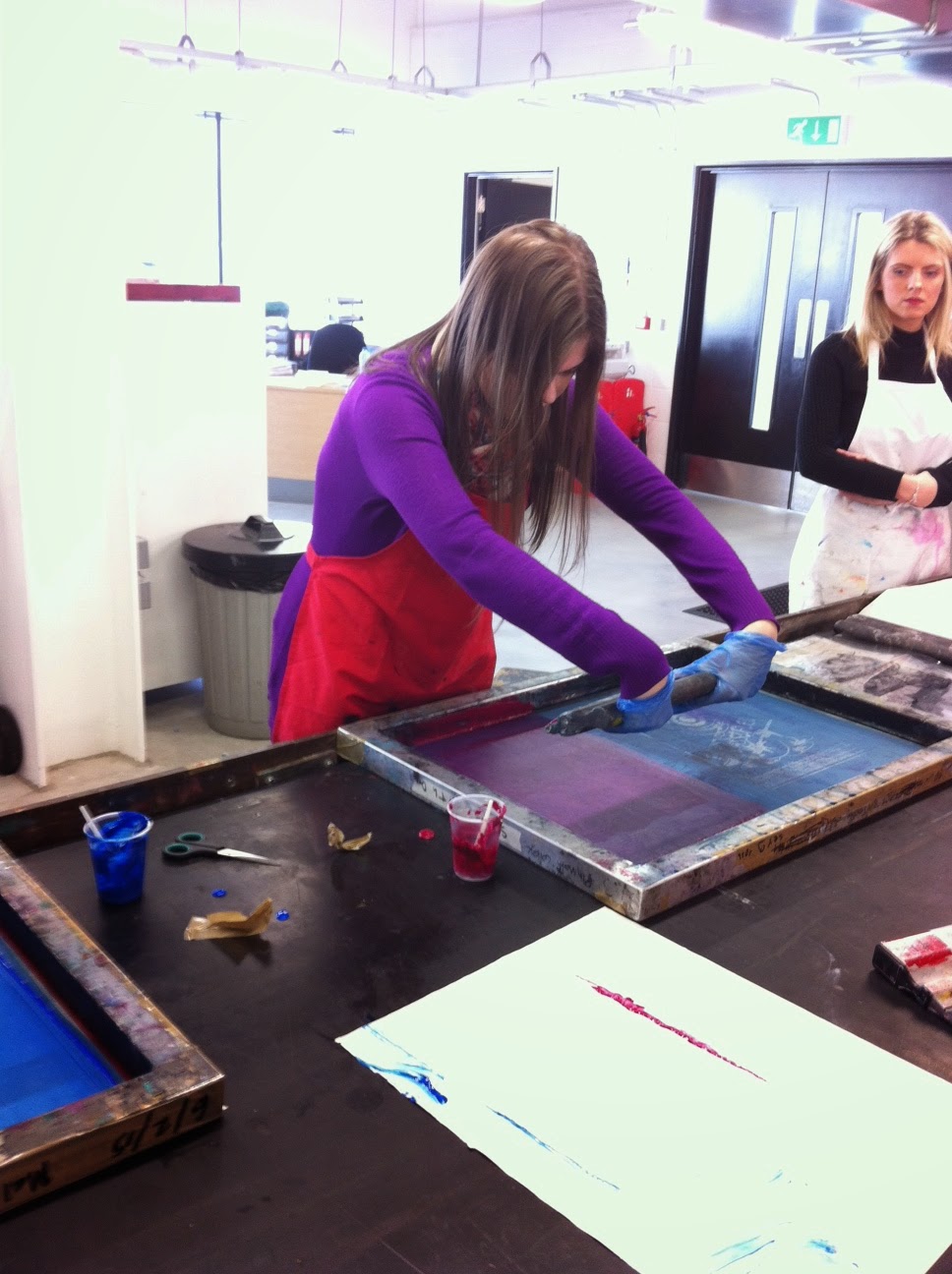
In this task i had to create a pice of art in the way that Banksy (the famous grafitti artist) would. I used the design that i used for my t - shirt to do this and made a stencil.
To start with i printed an image of my design on to a peice of paer.
I then started to cut certain parts out to create the stencil.
Once I was happy with the stencil i then layed it on a piece of paper and covered it with paint to create the image.
Some things i thought that i did well were how i think i cut out the right bits and very cleanly.
If i were to redo this task somethings that i would change would be the paint i used, i should have used spray paint but did not have access to it. If i had the lines would have been a lot cleaner.
Sunday, 15 February 2015
Friday, 13 February 2015
T Shirt Design Evaluation
Mind Map
The first thing I did was to create a mind map and a mood board so that I could get a few ideas of what I wanted to make. My mind map was split up into different target audiences and then again in what I thought these audiences would want in a T Shirt design.
Some positives of my mind map would be thta it was clear and easy to understand and it consisted of all the stuff that I wanted to cover.
If I were to create this mind map again I would spread it out more so that there is less empty space.
Mood Board
My mood board was just a more visual representation of my mind map where I used a few images for each section. The mood board was helpful as it gave me some inspiration for creating my designs, i could see what other relevant designs consisted of so that it would help me when creating my own.
Some positives of my mood board would be that it represents all my ideas but in a visual way meaning that i could get more of an idea of what i wanted my design to look like.
If I were to create this mood board again I would make sure that there were more images covering more themes, i would also make the images smaller so that they fitted onto the page better and did not overlap and distort the other images.
1st Designs
After I had created my mind map and mood board I had a few ideas that I was thinking about creating so I made a few illustrations so that i could see what they would look like before creating my final design on illustrator and so that i could decide which one i would create.
Some positives of my 1st designs would be thta they were clear an easy to understand and they meant that i could see what these designs could look like if i made them on illustrator.
If I were to create my 1st designs again I would take a bit more time making them so taht i could understand even more what they would look like, i would also try different options, perhaps using different colours.
Some positives of my mood board would be that it represents all my ideas but in a visual way meaning that i could get more of an idea of what i wanted my design to look like.
If I were to create this mood board again I would make sure that there were more images covering more themes, i would also make the images smaller so that they fitted onto the page better and did not overlap and distort the other images.
1st Designs
After I had created my mind map and mood board I had a few ideas that I was thinking about creating so I made a few illustrations so that i could see what they would look like before creating my final design on illustrator and so that i could decide which one i would create.
Some positives of my 1st designs would be thta they were clear an easy to understand and they meant that i could see what these designs could look like if i made them on illustrator.
If I were to create my 1st designs again I would take a bit more time making them so taht i could understand even more what they would look like, i would also try different options, perhaps using different colours.
Final Design
Once the illustrations had been done i decided on my favorite one (the Subaru made from rectangles). I then started to make it on Adobe Illustrator using an image of the car as a template and the shape tool to fill it in.
Some positives of my design would be that it was the exact silhouette of the car that i wanted and that it looked like something the target audience would want.
If I were to create this design again I would make sure that all the edged were as smooth as possible, try different ways of showing the wheels and using other shapes apart from rectangles to fill in the body.
Screen Printing
When the design had been created I sent it off to Sarah who printed the design on to acetate. We then went to Plymouth and started the screen printing process.
The first thing that we did was we cleaned an already used screen. We did this by first dousing it in B strip (a kind of bleach) this dissolved much of the dried on emulsifier, we then pressure washed the rest of it off and then soaked it in water to get all the chemicals off. We then checked it under a light so that we could see whether all the emulsifier had gotten out of the mesh other wise it would block the paint coming through when we were doing the printing.
After cleaning we then let the screens dry in a drying cupboard which was a box with circulating warm air. We left it for ten minutes until it was completely dry.
Once the screen was dry, one of the technicians applied the emulsifier (an oil based paint that is sensitive to UV light), making sure that it did not touch the edges. We then let the emulsifier dry in the drying cabinet.
Once that had dried we layed our acetate over the screen and the put it in a UV exposure unit, this was secured by a vacuum seal that went over the top of it. UV light shone through and and made sure that the emulsifier attached to the mesh and the emulsifier that was behind the silhouette was easily washed off with water.
This then meant that i had a screen with a template where paint could seep through and leave an image. The way we did this was create a paint using a coloring and a binder, put it at the top of the image and then quickly scrape the paint down with a squeegee (wooden for fabric and plastic for paper). After each time a screen print had been taken we then washed the paint out using a hose so that the mesh was not blocked when doing it again.
Some issues with my screen print were that some paint was trapped in the mesh and as a result the image did not come out as well as possible and i had to add some extra details on the wheels and the spoiler afterwards with a paintbrush. If i were to to do it again i would take a bit more time in the preparations so that there was no blockages in the mesh.
I feel that the final product was suitable for the intended target audience (young boys under 15), it is possible for it to come in many different colors and if the demand was there other vehicles or any other object could be printed in the same way.
Monday, 2 February 2015
David Carson - Experiment
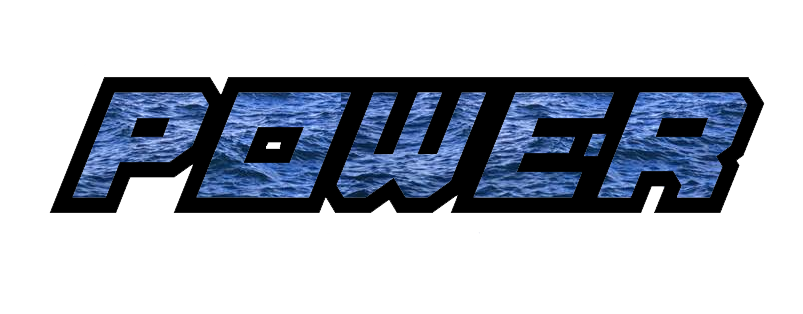
In this task i tried to experiment with typography in the way that David Carson does. To do this i chose a word and a font to that suits my final t-shirt design, in this case it was a bold font and the word was "Power".
Once i had chosen the font and the word i cut the outline of the word and scanned it through so i could edit it in photo shop. I did 5 different images with different backgrounds and then 1 with all the different backgrounds put together.
Banksy vs. David Carson
This piece shows a piece of text reading Blow Up getting larger and larger (Blowing Up) until it is no longer legible This is a great example of text becoming an image in just a few stages and of a piece that does what it says.
This image shows many words that are grouped together so densely that you cannot read most of them, they have become a background for some more understandable text which reads dont mistake legibility for communication.
In my opinion this piece shows that images can give out a message as well as, if not better, than just text. Not only does the text in this piece put across the message but as an image it does as well.
This image shows a some text reading "What the heck are you doing? You're going to be dead a really long time." Rather than just a solid colored text it has an image or some different colored patterns.
I like this piece because it sends across a message that you should do something with your life because sooner or later you will be dead and it will all mean nothing. I also like this piece because it looks good and is interesting and by using different sizes, arrangements, colors and patterns of the words it keeps the audience entertained and it is more like looking at art rather than reading a sentence.
This piece was created in response to the recent terror attacks in Paris due to islamic extremist taking offence to some of the illustrations of a satirical magazine (Charlie Hebdo). The main purpose of this image is that acts of terror only makes people who want peace stronger and will do more to achieve it.
The reason I like this piece is because it is very simple yet it gets the point across which is very complex, I also like how it is related to the individual case as it was the illustrators of the magazine that were mainly targeted.
This image shows a young child spray painting the words "Ghetto 4 Life" on a wall, it appears that the child is very privileged as he has his own butler.
In my opinion the message of this is that there are many people (especially younger people) at the moment pretend to be someone that they are not in an attempt to fit in. I think that Banksy was over exaggerating to prove the point that you should never change yourself for other people.
This image shows paintings on the wall that seperates Palestine and Israel. This wall not only seperated countries, it also seperated religions, friends and family. This wall also seperates the realatively wealthy israelis to the very poor palestinians. As a result many people (especially te palestinians) believe that "the grass is greener on the other side" and all that they want is to live at peace with their neighbours and experiance a better quality of life.
T Shirt Design - Final Design
After looking at all my previous designs i chose my favourite and made it in Adobe Illustrator.The design i chose was the rally car mad out of squares. I made this taking an image of the car and covering it in squares making sure that i did not go over the lines.
Once i had done this i removed the image of the car and all that was left was the silhouette, i then added the wheels and the image was finished. The image was then ready to be screen printed onto a T Shirt.
T Shirt Design - 1st Drafts
Once I had created the moodboard and mind map I drew out a few designs on to paper. This meant that i could see which ones looked the best and which ones i liked more. Once i had decided i then started making my favourite on Adobe Illustrator.
Car
Poster
Game
Bottle
Car
Poster
Game
Bottle
T Shirt Design - Mind Map
I used the same mind map as i did at the beginning of the units as my inspiration for designs have not changed.
Blurred Image - Blur
I started with an image of the nineties, britpop band Blur.
I then went into filter, blur, tilt shift. This effect blurs the top and the bottom of the image but leaves the middle unchanged. There is also the option to rotate the blur which means that i can chose which parts were meant to be blurred.
I then slanted it a little to the left so that all the faces were not blurred but the rest of the bodies were.
Here is the final image.
Blurred Image - Seat Leon FR
The image I started with was a phot of a Seat Leon FR driving up a road.
To start with I selected the quick mask tool and (by using a soft brush) painted the main subject of the image.
I then went into filter, blur, motion blur to make the car look like its is going very fast rather than just being still on a hill.
To start with I selected the quick mask tool and (by using a soft brush) painted the main subject of the image.
I then went into filter, blur, motion blur to make the car look like its is going very fast rather than just being still on a hill.
Blurred Image - Ducati Panigale 1199r
The image that I started with was a photo of someone driving a Ducati Panigale 1199r around a race track.
I then pressed the quick mask tool and the brush tool, chose a soft brush stroke and started painting the subject of the image (the main image of the bike).
I then presses the quick mask tool again to select it and then went into filter, blur, radial blur. Here is my final image.
I was very happy with this image because all though it is quite simple it really exaggerates the speed and the movement of the bike. It also allows the main subject of the image to stick out from the rest of the image which means you can really focus on the details bike.
Copyright, Moral Rights and Intellectual Property In Design Industry
Copyright gives the creator of a piece of work such as art, literacy, music and more the right to publish and sell that work, it also means that they are the only ones who are allowed to do it unless they give permission to others. If a copyright is broken, it is called an infringement.
Performing rights give the right for a live performance or any type of performance to take place as well as everything that goes a long with it such as fees and royalties.
Publication rights is a type of copyright that is given to anyone that publishes a peice of work first after the original copyright has expired. It is exactly the same as a copyright but without the moral rights.
Design rights protect anything that has been designed. It is protected for 15 years after the thing has been created or 10 years after it was sold (which ever was earliest).
Patents and Trademarks give the inventor of something ownership of it.
Intellectual property is anything that was a creation of the mind, for example if someone thought of a thing to paint that person would own it because they thought of it. However it is not official until a copyright has been made.
How do these impact the design process
Moral rights are the rights of anyone who has created a copyrighted piece of work, these rights can include being
able to preserve the ownership and the integrity of that piece of work.
Performing rights give the right for a live performance or any type of performance to take place as well as everything that goes a long with it such as fees and royalties.
Publication rights is a type of copyright that is given to anyone that publishes a peice of work first after the original copyright has expired. It is exactly the same as a copyright but without the moral rights.
Design rights protect anything that has been designed. It is protected for 15 years after the thing has been created or 10 years after it was sold (which ever was earliest).
Patents and Trademarks give the inventor of something ownership of it.
Intellectual property is anything that was a creation of the mind, for example if someone thought of a thing to paint that person would own it because they thought of it. However it is not official until a copyright has been made.
How do these impact the design process
The design process is limited by copyrighting because the things that you create must not be similar to anything that is already been protected by copyright. An example of this would be when creating a poster or advert the images that you use must have been created by you or you have been given permission to use the.
Moral rights limit the design process because it is the creators duty to protect and preserve the integrity of that piece of work. An example of a limitation would be making sure that the content of a piece of work is appropriate and legal.
Copyright can protect anything to do with the design process of a brand for example its logo or the products that they make however these are only protected if they do have design aspects about them. Copyright protects something as long as it offers a good level of creativity and design. It does not protect the brand make itself.
Logo - Ruthless Smile
The two random words I chose for this logo were "Ruthless" and "Smile". I then started to think about what company this logo could be for, in the end I decided that it would be for a record company.
Once I had decided what the logo would be for I started to draw a few designs so that i could decide on my favorite and then create it in Adobe Illustrator.
To create the logo I used many different shapes that i put together and used the shape builder tool to create a face. I also used the paintbrush tool to add some extra details and the font tool to create the title of the company.
Here is the final image:
Subscribe to:
Posts (Atom)